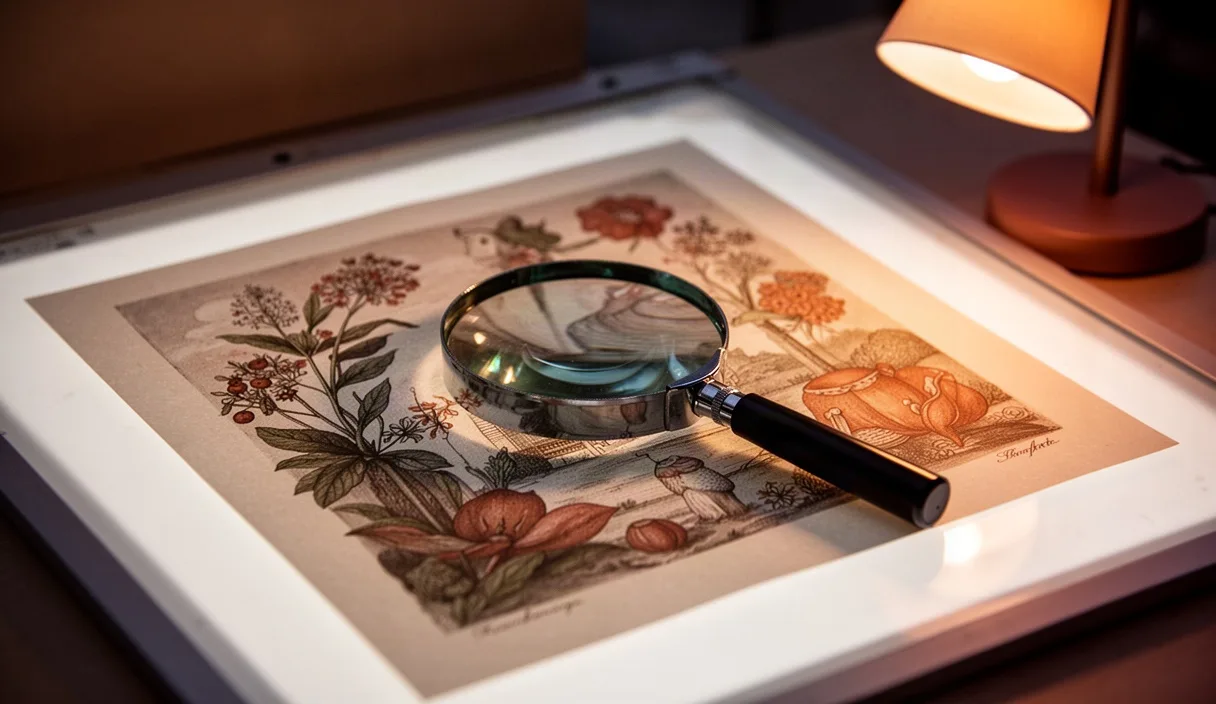
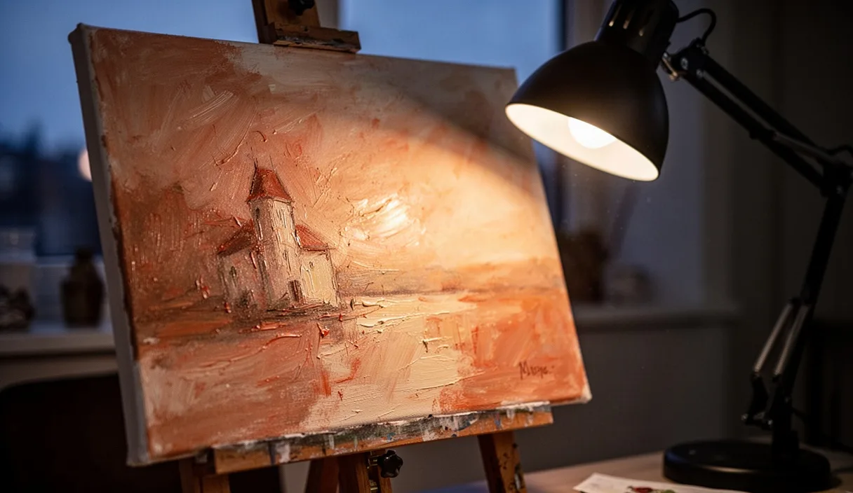
We spend most of our studio visits with students crouched close to a painting's surface, noses nearly touching the glazing, before we let anyone talk about what the picture "means." This order matters. A surface holds evidence: the pressure of a hand, the drying time between layers, the choice of a tool that left its own signature in the paint. Read in sequence, these physical facts tell us how a work was built before we ask what it was meant to say.
This checklist comes out of years of handling student work and museum loans under raking light, turning paintings toward windows, and writing condition notes that had to be plain and checkable by someone else later. It is not a theory of art. It is a set of habits for looking, in an order that keeps assumptions from creeping in too early.
Why we start with surface, not meaning
When we ask a student what a painting "means" before they have looked at how it was made, we get guesses dressed up as insight. The guesses are not wrong because the students lack imagination. They are wrong because they lack information. A cracked, brittle paint film might indicate an old underbound medium, not an intended symbol of decay. A rough, scraped passage might be a pentimento the artist covered in frustration, not a deliberate gesture toward abstraction.
Surface-first looking also slows down the eye in a useful way. Meaning-first looking tends to scan for subject matter and stop. Surface-first looking makes a student spend four or five minutes on a single square inch of canvas, and that patience carries over into every later stage of analysis, including the interpretive one.
We tell students: treat the painting like a object that arrived in a crate with no provenance sheet. What can the object itself tell you, through touch-adjacent observation, before anyone hands you a wall label?
Setting up raking light to check texture
Raking light means light that strikes the surface at a low angle, close to parallel with the picture plane, rather than straight on. At a low angle, every ridge of impasto casts a small shadow, every scrape in the ground shows as a dark line, and brush ridges that are invisible under flat gallery lighting suddenly read as a topographic map.
In a classroom or study room, we set this up with a simple handheld LED lamp or even a smartphone flashlight, held about 20 to 30 centimeters from the surface at an angle close to 15 or 20 degrees from the picture plane. We dim the overhead lights if possible. The difference is immediate: a painting that looked flat under fluorescent light will show its brush direction, its canvas weave, and any later in-painting that sits slightly proud or sunk relative to the original layer.
- Move the light slowly across the surface rather than holding it still, since texture reveals itself through shifting shadow, not a single static angle.
- Check both horizontal and vertical raking angles. A brushstroke pattern that's invisible from one direction often jumps out from the other.
- Note any areas that look unnaturally smooth compared to their surroundings. These are often later restorations or fills.
We ask students to sketch a quick texture map on a photocopy or printout of the painting, marking ridges, cracks, and smooth patches with simple symbols. This map becomes the first page of their written record.
Reading the edges where colors meet
Where two colors meet, a painter made a decision, and that decision leaves a trace. A hard edge, where one color stops abruptly against another with no transition, usually means the first color was dry before the second was applied, or that the artist used a straightedge or masking method. A soft edge, where colors blend into each other, means the paint was wet into wet, worked together while both were still workable.
We ask students to pick three or four color junctions in a painting and describe, in plain terms, whether the edge is hard, soft, or somewhere between, and whether there's a visible ridge of paint built up at the boundary, which can happen when a brush drags pigment from one zone into another.
| Edge type | Likely technique | What to look for |
|---|---|---|
| Hard edge | Dry layering, masking, or careful brush control | Sharp line, no color mixing at the boundary |
| Soft edge | Wet-into-wet blending | Gradual color shift, visible blending strokes |
| Scraped edge | Palette knife or rag removal | Thin, uneven paint with ground showing through |
Edges also tell us about sequence. If a blue shape sits cleanly on top of a dry red field with no red showing through the blue's edge, the red was almost certainly painted first and allowed to dry. If the edge shows a thin rim of purple where the two mixed, they were likely worked at the same time.
Looking for underlayers and pentimenti
Pentimenti are changes a painter made and then painted over, from the Italian word for "repentance." Over time, as oil paint becomes more transparent with age, these changes can become faintly visible, especially in a hand shifted a few centimeters, or an outline that was moved. We teach students to look for faint ghost-lines near contours, particularly along figures' limbs or architectural edges.
In a teaching setting without access to X-radiography or infrared reflectography, the naked eye under raking light and simple magnification is what we have, and it is enough to spot the obvious cases. We ask students to look specifically at:
- Doubled contour lines, where a faint second edge runs parallel to the visible one
- Patches where the paint texture differs slightly from its surroundings, suggesting a reworked passage
- Areas where craquelure, the fine network of age cracks, runs differently than in the surrounding paint, which can indicate a different drying time for an underlayer
If a student suspects a significant pentimento, the next step is not to guess at its meaning but to note its location precisely, on the texture map from earlier, and flag it for someone with access to technical imaging. We are honest with students that confirming a pentimento with confidence usually requires infrared or X-ray equipment that a classroom does not have.
Noting tool marks: brush, knife, finger, or machine
Every tool leaves a distinct mark, and learning to tell them apart is mostly a matter of handling enough examples that the differences become automatic. A bristle brush leaves parallel ridges, sometimes with small individual bristle tracks visible at the edge of a stroke. A palette knife leaves flat planes with sharp, angular edges and often a slight lip where the knife lifted off the surface. A finger or thumb leaves a smoother, rounded depression, sometimes with a faint fingerprint pattern still visible if the paint was thick enough.
Mechanical or sprayed application, more common in contemporary work, tends to produce an even, almost textureless field with no directional ridges at all. When students encounter this, we ask them to check the edges of shapes for a slightly fuzzy or stenciled quality, which often indicates masking tape or a spray technique rather than hand application.
- Identify the stroke direction by following ridge lines with your eye, not your finger, since touching the surface of a historic or valuable work is rarely appropriate without specific permission.
- Estimate the tool width. A 2-centimeter-wide ridge suggests a different brush than a hairline 2-millimeter mark.
- Check for consistency. A single hand usually repeats certain habits, like always starting a stroke from the same side.
We remind students that tool identification is observational, not definitive. A confident claim like "this was done with a size-12 filbert brush" belongs in a conservator's condition report, not a student paper, unless that student has cross-checked it against documented studio materials.
Writing a plain description before any interpretation
We ask students to write a paragraph of pure description, no more than 150 words, before they write a single sentence of interpretation. This paragraph should read almost like a shipping manifest: color locations, texture notes, edge types, tool marks, condition issues. No adjectives like "haunting" or "powerful."
Here is the kind of sentence we want: "The lower third of the canvas shows a thick, ridged application of ochre paint, roughly 3 to 4 millimeters in height at its peak, applied with a flat tool, likely a palette knife, over a thinner red-brown underlayer visible at the edges where the ochre has thinned." Compare that to a sentence we discourage: "The lower third feels heavy and grounded, like the weight of memory." The second sentence might be true as a response, but it cannot be checked by another viewer standing in front of the same painting, and that is the test we use.
Once the plain description exists on paper, interpretation has somewhere to stand. A claim about mood or meaning that references the ochre ridge, the underlayer, and the knife marks is a stronger claim than one that floats free of the object.
Using the checklist in a classroom setting
We run this checklist as a four-part rotation when we have access to actual paintings, study photographs, or high-resolution digital scans with good contrast. Each student gets roughly 12 to 15 minutes per painting before rotating, which is enough time to go through the full sequence once without rushing, though a second pass always reveals something missed the first time.
For groups without physical access to paintings, we use high-resolution digital images enlarged on a shared screen, though we are upfront that raking-light analysis does not translate well to a flat photograph unless the image was specifically shot with side lighting. Museum websites increasingly post detail photographs under raking light for exactly this teaching purpose, and these are worth seeking out before falling back on a standard reproduction.
We keep a simple shared worksheet with seven rows, one for each stage of this checklist, so that when students compare notes afterward, the group can see where observations agreed and where they diverged, which is often the most useful part of the exercise.
Common mistakes
The most frequent mistake is skipping straight to subject matter and symbolism, which we address by physically requiring the plain-description paragraph before any discussion begins. A close second is mistaking condition damage, like a later varnish yellowing or a restorer's fill, for an intentional artistic choice. When in doubt about whether a mark is original to the artist or a later intervention, the honest answer in a classroom is "we would need a conservator's report to be sure," and that answer is acceptable.
A third mistake is touching the surface to test texture, which should never happen without explicit institutional permission, since skin oils and pressure can damage fragile paint films. We use light and distance instead, always.
Next steps for continued practice
Students who want to build this skill further should spend time in a conservation lab or ask a local museum whether they run technical study sessions open to students, since seeing an actual X-radiograph or infrared image alongside the visible surface closes the gap between what the eye can guess and what imaging can confirm. Practicing on a few paintings a week, even through study photographs, builds the pattern recognition that makes the checklist feel less like a form to fill out and more like a way of seeing.