We keep a shelf of test tiles in the studio: scraped gesso, sanded panel, raw linen, a corner of plaster that never got painted. When someone asks why texture still matters in an age of infinite digital images, we hand them a tile instead of an answer. The weight of it, the way light catches the ridges differently depending on where you stand, the faint smell of rabbit-skin glue still trapped in the plaster. None of that survives a photograph, and that gap is the whole subject. This is not an argument against digital images. We use them constantly, for reference, for documentation, for selling work to people who will never stand in our studio. But we have noticed that the more images multiply, the more viewers forget what a surface actually does when light and a body move across it. This piece is about naming that difference so we can use texture on purpose, rather than by habit.
What we mean by texture beyond "how it looks"
In most conversations, texture gets treated as a visual effect, something that reads as "rough" or "smooth" on a screen. We use the word differently in the studio. Texture is the physical record of a process: the angle a brush was held, the pressure of a palette knife, the number of coats sanded back, the grit of the paper under graphite. It is a result, not a decoration applied afterward. A flat-looking black square and a black square built from eleven layers of carbon-based ink can look nearly identical in a photograph taken under even light. But run a hand two centimeters above the second one, without touching, and you feel a change in air temperature near the surface, a product of the ink's slight sheen and the way it holds ambient heat differently than paper. That is texture doing something a flat description cannot. We also distinguish between texture that is additive, built up with gesso, modeling paste, or collage, and texture that is subtractive, carved, sanded, or etched away. Each leaves a different kind of edge. Additive texture tends to catch light on raised peaks and cast small shadows in the valleys between them. Subtractive texture often reveals a different material underneath, a second color or a rougher grain, so the texture carries information about what was removed, not just what was added.
A short list of texture types we work with regularly
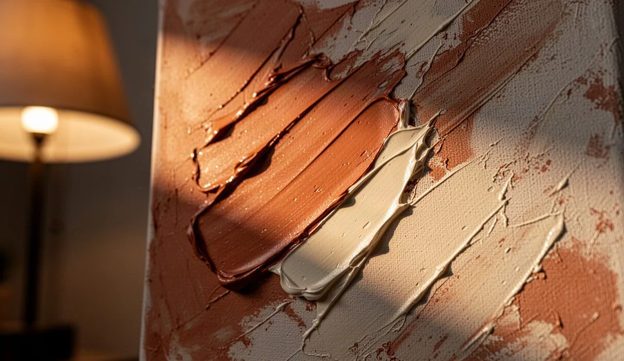
- Impasto: thick paint holding the shape of the tool, usually a knife or stiff brush, visible as ridges that cast real shadows.
- Craquelure: intentional or aged cracking in a ground layer, which tells a viewer about drying time and the flexibility of the materials underneath.
- Collage grain: the tooth of paper or fabric edges, which catches raking light differently than the paint layered over it.
- Burnish: a polished area, often from repeated rubbing or pressing, that reflects light at a sharper angle than the surrounding matte surface.
The information held in a brushstroke or a fold
A single brushstroke, examined closely, tells you the loading of the brush, roughly how much paint or ink it was carrying, the speed of the hand, and the angle of the bristles relative to the surface. A stroke that starts thick and thins to a dry skip across the tooth of the paper tells you the brush ran out of material partway through, which means the mark was made in one continuous motion rather than touched up. We rely on this kind of reading constantly when looking at older work, since it is one of the few ways to tell a confident original pass from a later, hesitant repair. Paper and fabric hold a parallel kind of record in their folds. A crease that has been folded and unfolded many times develops a soft, slightly fibrous break along the line, different from a crisp, single fold that still holds a sharp edge. Conservators use this distinction to estimate handling history, though we want to be clear that dating or attributing work from fold patterns alone is a specialist's job, not something to guess at from a photograph. If the history of an object actually matters, for insurance, for archival purposes, or for sale, that question belongs with a trained conservator or appraiser, not with a confident eye. In our own mixed-media pieces, we have started logging texture decisions the way a cook logs a recipe: three passes of thinned gesso, 80-grit sanding between the second and third, one pass of raw pigment rubbed in and wiped back. Keeping that log means we can repeat an effect that worked, or diagnose why a particular panel is shedding paint six months later. Texture, in other words, is also a maintenance record.
Why infinite digital images change what viewers expect
A phone can now hold tens of thousands of images without strain, and a single afternoon of scrolling can expose a viewer to more images than a nineteenth-century painter might have seen original paintings in a lifetime. That volume trains the eye toward fast pattern recognition, color, composition, subject, and away from slow surface reading, which takes physical proximity and time that a feed does not reward. We have watched this shift in our own gallery visitors. Ten years ago, people leaned in close to paintings more often. Now many viewers photograph a piece from three meters away and move on, planning to look at the photo later, which usually means looking at a flattened, color-corrected, texture-erased version instead. The photograph becomes the primary memory of the object, even though it has quietly deleted most of the physical information. This creates a strange asymmetry: the more images exist, the less texture-literate average viewing becomes, even as texture-based work, highly worked surfaces, visible process, hand-built ceramics, remains popular precisely because it photographs as "interesting." Viewers are drawn to the idea of texture captured in a flat image, often without encountering the real thing closely enough to understand what produced it. We do not think this is dishonest on the viewer's part, just a predictable result of how images now circulate. A comparison helps make the gap concrete:
| What a photograph usually shows | What standing close shows |
|---|---|
| Overall color and composition | Variation in sheen across one color field |
| Rough shape of textured areas | Actual depth of ridges, measurable in millimeters |
| A single lighting angle, fixed by the photographer | Texture shifting as the viewer's own position changes |
| Surface condition at time of shooting | Surface condition plus signs of age, repair, or handling |
Standing close: what texture tells a viewer that a screen can't
Stand thirty centimeters from a heavily worked oil surface and move your head slightly left and right. Ridges that were invisible from across the room suddenly throw small shadows, and the color itself seems to shift, not because the pigment changed, but because the angle of light hitting the raised and recessed areas changed. This parallax effect is physically impossible to reproduce in a single static image, no matter how high the resolution. Texture also communicates scale and effort in a way flat images compress. A panel with visible knife marks eight millimeters deep required real drying time between layers, often weeks, since thick paint needs air exposure to cure without cracking. A viewer standing close can estimate that time investment almost intuitively, from the depth and layering of the marks, even without knowing the technical details. On screen, the same marks might read as a filter or a texture brush effect in design software, collapsing a weeks-long process into something that looks instantly generated. Smell and temperature play a small but real role too. Raw canvas, oil paint, and beeswax each carry a distinct smell at close range, and many viewers register this without naming it consciously, folding it into their overall impression of "handmade" quality. We have had visitors stand in front of an encaustic piece, wax-based, and comment that it feels "warm" even though the room temperature is identical throughout the gallery. What they are responding to is the honeyed smell and soft sheen of beeswax, cues that only exist within arm's length of the object.
Where texture can mislead rather than inform
Texture is not automatically honest. A surface can be built specifically to simulate age, wear, or hand-process that never happened, and this is common enough in reproduction furniture, decorative painting, and some digital-to-physical print work that buyers should treat heavy texture as a prompt for questions, not proof of authenticity on its own. Commercial "faux finish" techniques can replicate the raised look of hand-applied plaster using textured roller systems or embossed vinyl, at a fraction of the labor cost. From two meters away, under gallery lighting, these can be difficult to distinguish from genuine hand application. The giveaway is usually repetition: a hand-applied texture varies subtly across a surface, since no two knife strokes or trowel passes are identical, while a mechanically textured surface often repeats a pattern at regular intervals, visible once you know to look for it. Digital printing adds another layer of possible confusion. Some giclée prints are varnished with a textured gel medium applied over the flat print specifically to simulate brushwork, a legitimate technique when disclosed, but one that can be presented misleadingly as "hand-painted" if a seller is not being straightforward. If the authenticity or process of a piece matters to a purchase decision, it is reasonable to ask the maker or seller directly how a surface was produced, and to get that answer in writing for anything above a casual purchase. A short list of questions worth asking before trusting texture as evidence of process:
- Does the texture vary irregularly, or does it repeat at a fixed interval?
- Is there a consistent direction to the marks, matching a plausible tool and hand motion?
- Does the texture correspond to the underlying color layering, or does it sit as a separate, later-applied layer over a flat print?
- Can the maker describe the process specifically, including materials and rough timeline, rather than in vague terms?
Keeping texture intentional in mixed-media work
In our own practice, texture earns its place by doing a job, not by being added because a piece feels unfinished. Before adding any raised or carved element, we ask what information it is meant to carry: weight, age, interruption, repair. If we cannot answer that, we usually leave the surface alone a while longer. We also test texture under more than one lighting condition before calling a piece finished. A surface built under studio lamps, usually a soft, even light, can read completely differently under the raking side-light common in home display or gallery spotlighting. We have reworked ridges that looked subtle in the studio and turned out to cast harsh, distracting shadows once hung near a window. One practical habit: photograph work-in-progress texture under a single raking light source, roughly 30 to 45 degrees from the surface, early and often during the process. This exaggerates ridges and valleys enough to catch problems, areas that are too uniform, textures that read as accidental rather than built, before the final layers lock them in place. If you are working toward a piece meant to be reproduced digitally as well as sold physically, decide early which version is the "real" object and which is the record. We treat the physical surface as the primary work and the photograph as documentation, which changes small decisions, like favoring texture that holds up under handling over texture that merely photographs well under one angle of studio light.