We set ourselves a small, stubborn problem: paint the same study twice, once using pigment we mixed by hand from raw powder and binder, once using a palette an AI color tool handed us in about four seconds. Same subject, a still life with three ceramic jars and a linen cloth, same paper weight, same light. We wanted to know what actually changes when the hand leaves the process versus when it stays in.
This isn't a referendum on whether software can "understand" color. It's a maker's comparison: what you feel in the muller, what you see on the swatch, what the paint does when it hits tooth and ground. We kept notes at every stage so the differences would be traceable, not just impressions.
Starting the same painting two ways
We prepped two identical panels: 300gsm cold-press paper taped to board, and a small stretched linen canvas primed with two coats of rabbit skin glue ground. The reference photo stayed on a tripod three feet from both work surfaces, same north-facing window light, shot at 2pm so the color temperature wouldn't drift mid-session.
For the hand-mixed side, we laid out raw pigment: natural ultramarine, yellow ochre, a burnt sienna, titanium white, and ivory black, all as dry powder in small glass jars. For the AI side, we used an open-access palette generator, uploaded the same reference photo, and asked for a five-color palette suited to oil or gouache work. It returned hex codes and suggested pigment names, not actual paint.
Already there's a structural difference worth naming: the hand method starts with raw material and ends in a decision. The AI method starts with a finished decision and leaves the material step to us. That changes what the first twenty minutes of work actually involve.
How we mixed the palette by hand
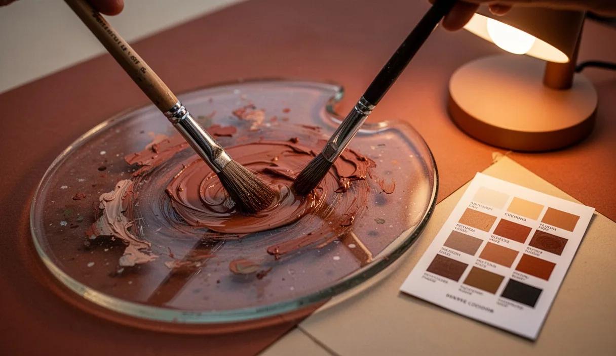
We measured pigment by weight on a small gram scale rather than by eye, since dry pigments vary wildly in density. Ultramarine took about 4 grams to match the visual strength that 2 grams of ochre gave us, so weight isn't a stand-in for intensity. Binder was gum arabic solution at roughly a 1:3 ratio of binder to pigment paste, adjusted by feel as we muller down each color on a glass slab.
Mulling took the longest. Ultramarine needed nearly six minutes of steady figure-eight grinding before it stopped feeling gritty under the palette knife. Ochre was faster, maybe ninety seconds, since it's a softer, already fine-particle clay pigment. We tested each batch on a scrap of the same paper stock before committing it to a jar, since dried swatches often shift a half-step cooler or warmer than the wet paste suggests.
The final hand palette:
- Ultramarine mixed slightly warm with a touch of ochre, used for the shadowed side of the jars
- A grey built from black and white rather than bought pre-mixed, so the undertone stayed neutral instead of leaning blue
- Burnt sienna cut with white for the linen's warm highlights
- A near-black made from ultramarine and burnt sienna together, no tube black, for the deepest shadow under the jars
That last mix, a chromatic black, is something a dry hex-code palette would never suggest, because it's not a color so much as a relationship between two pigments granulating together on wet paper.
What an AI palette generator produced instead
The tool gave us five swatches: a flat ultramarine blue (#3B4D8C), a dusty rose (#C98A7D), a pale cream (#EDE3D0), a mid grey (#8C8C86), and a dark brown (#3E2E28). Each came with a suggested pigment equivalent, like "burnt umber" or "cerulean blue," but no ratios, no binder notes, nothing about particle size or granulation. We treated these hex codes as targets and mixed toward them using the same raw pigments as the hand side, since we don't keep synthetic dye-based paints that would match hex values directly. This took real effort: matching a flat sRGB value with a mineral pigment is approximate at best, because screen color and reflected pigment color behave differently under the same light.
Two of the five swatches were close enough to reach within a few mixing attempts. The dusty rose took four tries, since no combination of our ochre, sienna, and white quite hit that particular muted pink without looking chalky or too orange. We eventually added a trace of the chromatic black to grey it down, which isn't something the tool suggested.
What stood out was the palette's internal logic: the five colors worked as a flat, evenly-spaced set, pleasant together in isolation, but none of them accounted for how pigments interact once water or binder is added. The grey, for instance, looked right as a chip but turned slightly green once laid next to the AI's blue on wet paper, an interaction no swatch viewer would show.
Testing both on paper and on canvas
On the 300gsm cold-press paper, the hand-mixed ultramarine granulated beautifully, pooling into the paper's texture and creating small dark flecks where pigment particles settled unevenly, a hallmark of natural ultramarine's coarser grind. The AI-matched blue, mixed from the same ultramarine toward a flatter hex target, granulated less, simply because we'd cut it with more white to hit the lighter target value, and dilution reduces granulation.
On canvas, differences showed up in coverage. The hand palette's chromatic black, applied over the glue-primed ground, needed two passes to read as a true dark, since the absorbent ground pulled binder away from the pigment on the first pass. The AI-matched dark brown, being a single-pigment-leaning mix rather than a layered mineral blend, covered in one pass but looked flatter, with less depth when viewed at an angle.
We also timed the sessions. Painting with the hand-mixed palette, including the mulling time from earlier, took about ninety minutes total for a small study. Painting toward the AI-generated targets took seventy minutes, mostly because we skipped some of the slower granulation testing, but we spent an extra fifteen minutes just hunting for the right ratio to match each hex swatch, time that didn't exist on the hand side because the hand side never had a fixed target to miss.
| Factor | Hand-mixed palette | AI-generated palette |
|---|---|---|
| Total prep + paint time | About 90 minutes | About 70 minutes, plus 15 spent matching hex targets |
| Granulation on cold-press paper | Strong, visible texture | Minimal, due to dilution toward target value |
| Canvas coverage | Two passes for full dark | One pass, flatter result |
| Unexpected mixes discovered | Chromatic black from two pigments | None, palette was fixed before mixing began |
Where drying time and binder changed the outcome
Gum arabic binder in the hand-mixed paint dried to the touch in about fifteen minutes on paper, but didn't reach full depth of color, what some painters call the dry-back, for closer to two hours. The ultramarine shadow mix looked notably darker wet than it did once fully cured, which meant we had to slightly overmix the dark areas to compensate, something you only learn by watching a specific pigment dry, not by reading a color code.
The AI-matched colors, mixed with the same gum arabic since we used identical binder across both tests, showed the same dry-back behavior, which tells us the shift is a property of the binder and pigment load, not of how the color was chosen. This matters: no palette generator accounts for binder behavior, because binder isn't part of a color value, it's part of a material process.
On canvas, the glue-primed ground absorbed moisture unevenly where we'd applied the gesso slightly thicker near one edge. Both palettes showed a faint tide line in that spot as the paint dried, confirming the issue was in our priming, not in either color-selection method. We'd note here that uneven grounds are a common, fixable problem, worth checking with a straightedge and raking light before you blame your pigment choices.
What we'd keep from each method
From the hand-mixed side, we're keeping the practice of testing pigment on scrap material before committing it to a jar, and the chromatic black mix, which we didn't expect to need but now reach for regularly. We're also keeping the gram-scale habit, since eyeballing pigment weight led to at least one noticeably weak batch of ochre early in testing.
From the AI-generated side, we're keeping the idea of generating a palette for initial reference, especially for color relationships and evenness of spacing across a composition, before we touch pigment. It's a fast way to sanity-check whether a planned five-color scheme has enough value contrast, something you can check in seconds on a screen rather than minutes of mixing.
What we're not keeping is the expectation that a hex code can tell a mineral pigment what to do. The two systems describe different things, one describes a target appearance, the other describes a material behavior, and conflating them cost us real time at the mixing table.
Common mistakes
- Trusting a wet swatch's color strength without letting it dry back fully, especially with gum arabic or watercolor binders
- Matching hex values by eye on a screen that hasn't been calibrated, which can shift blues and greens noticeably
- Skipping the scrap-paper test before mixing a full batch, which wastes pigment if the ratio is off
- Assuming an AI-suggested pigment name, like "cerulean," matches the historical or mineral version of that pigment rather than a synthetic approximation
Next steps for your own comparison
If you want to try this yourself, start small: pick a three-color palette, not five, and mix one by hand from raw pigment while generating the other from a photo or color tool. Keep a simple log with gram weights, binder ratios, and drying times, since that record is what actually lets you compare the two methods later instead of relying on memory.
Test both on the same paper or ground, under the same light, and let everything dry fully, ideally overnight, before judging the final color. If you're working toward a specific client brief or a reproducible commercial color, and precision matters more than feel, it may be worth consulting a professional colorist or a paint chemist, since matching pigment to a digital color standard at scale involves measurement tools, like a spectrophotometer, that go beyond what most studio setups include.